Here's the actual text. I used Ian the Green's ink here rather than the ink I'd used for the test (Higgins India Ink). It is a thinner consistency than the Higgins, which is what I usually use on scrolls, and allows for some gorgeous, light, fine lines. If the picture allows you to zoom in, you should be able to see those in the strokes, and in the places where I dotted the I's.

Notice the blank spaces left for the capitals to go later.
Oh, and, stuff I didn't take photos of: There is work that no one ever really gets to see, and some of that is research, as I've mentioned, but some of it is layout and engineering. Measure twice, cut once, as the carpenters say. You need to first measure out the framing margins, beyond which no writing or decorating will go, and then inside that you measure and mark your illumination margins, which gives you your text block to work with. If you hadn't noticed already, the margins are a different width all the way around. This is period! You gave more space to the outer and bottom margins, which not only looks nice, it lets grubby fingers turn the pages without getting in the way of the writing.
Now it's time for roughing in figures, critters, line enders, and other illumination. On the mockup at the bottom left, of the next picture, you can see where I tested one idea; looking at the actual source material, though, I discovered that these figures are waaaay too big in comparison. The figures in the Luttrell Psalter are typically only about as tall as five or six lines of text. There are bigger ones, but they are almost all grotesque figures whose heads and bodies might take up about half the page, but they end in vines and leaves that form a border for the rest of that margin. I don't want to do that here.
The people who expressed an interest in this scroll did say you wanted to know more about my process. Welcome to the inside of my head. I get long-winded because I think I'm being educational. I hope you don't mind.
All right, enough talking, more drawing!
(Image missing)
Okay, here we are about two hours later (that's all?) with stuff mostly penciled in. I've included closeups of the various line enders and grotesque critters in the margins, as well as closeups of the archer and crossbowman.
Stuff you don't see: lots of measuring. The leaves of the left margin are spaced evenly and had to be a uniform size in order to match the Luttrell Psalter ("LP"). Also, lots of erasing. I did my best, but the archer and crossbowman still don't match the originals. I mostly got the proportions right, so that's something, but some of my angles are wrong, and of course, I only have a small, blurry copy of the crossbowman to go off for things like the drape of his clothing. (Drapery is HARD.) Fortunately, it's possible to view the entire LP in glorious detail online, along with thousands of other manuscripts, thanks to the efforts of libraries all over the world to digitize their collections of one-of-a-kind materials like this one. I'll just have to move my laptop to my scribal worktable and open the viewer.
Some more detail closeups. Sorry for the poor quality, zoomed in images require more light and I didn't have any.

Fun with vines, coming off a line ender or line fill, or whatever they're officially supposed to be called.

The left border is relatively skinny, but the evenly spaced and equally sized leaves still provided a challenge to measure and draw.

A whimsical grotesque from the Luttrell Psalter. I'm getting most of my border and critters from page "158r" of the book itself. (In manuscripts, "r" and "v" stand for "recto" and "verso", the front or back of a single leaf or "folio" of the book. There, now you've learned a thing today.)

Another look at the critter, sort of half bird, half fish, only wearing a cloak? Don't ask me, medieval people were weird sometimes.
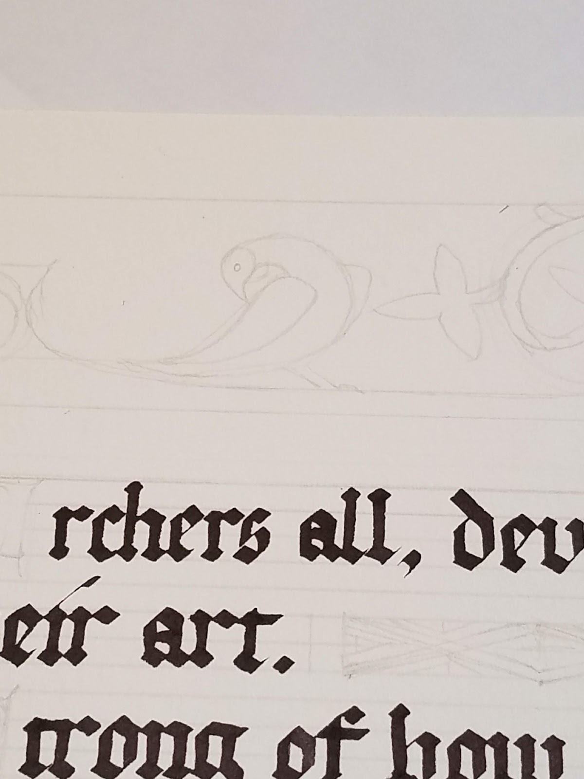
I thought this dove-like bird was especially sweet.
And here, finally, are the archer and crossbowman figures. You know, sort of the whole point of this scroll?)

(Edit: As of December 2018, I discovered that for some reason every image on this post had been eaten, and I'm not able to replace them all because I can't find them all. My picture of my pencil and click eraser are missing.)
All right. The next steps will be to make sure I have enough of the colors I'm going to need in order to color this (right now I have no pink), and then to get started laying in the base coats of everything. I've decided to skip the gold after all, and use yellow ochre as a substitute. Hopefully it will look okay!
Thanks for enjoying a nice long post. See you next time!
No comments:
Post a Comment