Showing posts with label Bran's Kings Chalice 2018. Show all posts

Tuesday, August 14, 2018

Final steps - Bran's Chalice scroll 4


Here we are at the finish! The final step on almost any scroll is the outlining. It takes a long time and can be tedious, but the final result is well worth it.

Here's the first picture; if you look closely you can see that top half of the border has not yet been outlined, while the bottom has. It just makes the edges that much more crisp and helps clean up the overall appearance. The leaves and vine also get a bit of separation from the background. I don't really like the phrase "makes it pop" but, well, that's what it does.


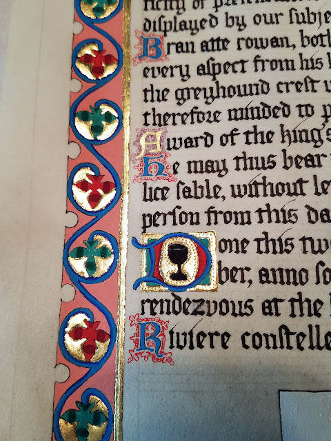
And here is the border with the outlining complete. You also can see some of the filigree that I added to the smaller capitals.

More of the filigree and a better look at the smaller initial. The black chalice inside the letter is the badge of the award that the client earned.

The kingdom seal...

Some of the line enders. Now, when I first started on this piece, I forgot that I needed to gild two of the line enders, so I went back and used a flat adhesive rather than the miniatum, which gives a raised finish. Luckily, the parchment was a forgiving enough surface that I was still able to texture the gold, which you can see in the middle line ender.


And of course, the big initial D at the beginning of the piece, because I can never get enough of how well it turned out. I'm not sure if the outlining here is really visible, since it's around the dark blue and red, but you can see it around the outer gold "trim" as well.


And then it was time to finally texture the gold! If you live in the US, Michael's carries "embossing styluses" in a three-pack for five dollars. The smallest one is the only one I have used so far, but five dollars for a single tool is still a good price, let alone three.

The way I did was first to practice with a pencil, to get a feel for how to freehand the vine shapes. I've heard that other artists use a stencil and get the shape they want from that, which would be a terrific technique for a symmetrical design, but the Luttrell Psalter is more organic in layout. Hence the freehand drawing. Usually when I'm drawing ivy, I just sketch in a vine, drop leaves on it, and then draw the outer edges, but you can't do that with gold. There's no erasing a dimple in the metal once you've placed it. Practice with pencil first on paper to get the hang of it! 

The way it worked best for me was to draw the line that made up the inside of the curve and leaf shape, and then go back and draw the outside of the curve as it sweeps in and becomes the inside of the next section of vine. I don't know if that makes sense. It would probably be better if I had video of the technique, but I don't.

Once practice was out of the way, I sort of eyeballed the shape of the gold to see where leaves would fit best. Then I started "drawing" them in by pressing dots into the gold in a curving line, anywhere I wanted the vine to be. If you do this, take your time, give yourself space for the leaves and for the outer curve of vine around the leaves, and keep an eye on your available space. I ended up adding a couple of extra curls here and there to fill in blank areas.

After the vine is drawn, you go back and fill in the background with lots and lots and lots of dimples. It's a little tedious, actually, yet painstaking at the same time, because you do want to pay attention so that the dimples are evenly spaced, or so that you don't over-treat an area and maybe break through the gold. As far as I can tell, I didn't do that, so maybe it's not as much of a worry as I think it is.

Finally, I went back and outlined my vines one last time, pressing a little harder than the background dimples, to help the vines stand out just a little bit more. And the result on that was terrific. Take a look. (Most of these pictures should be clickable to open larger in a separate window.)


Every bit of gold got some kind of texture, even if it was only a straight row of dots along the trim, or a bit of outlining in the gold surrounding each leaf.


 And here it is! After a couple of months (minus a couple weeks for vacation), it's finally complete. I wanted to wait until the client had seen it before I showed all of you. But he's very happy to finally see a scroll for an award he received twenty years ago!


And all that was left to do was sign my name on the back.


Once my client has the payment ready to go, I'll hand it off, and he can get signatures from the people who were "king and queen" when he first received the award, and then it will be official.

Thanks for following along! I'll be happy to answer any questions you might have.

Thursday, August 9, 2018

Time for the white work -- Bran's scroll part 3


And here we are at the next to last stage of most illumination, the white work. Laying in the base colors is fun if a little boring, shading helps to bring the image to life and give it depth, and white work is where things really begin to dance. You're adding highlights in some areas, and in others just whimsical decoration, but in every area the illumination really starts to look like a finished product rather than a flat layer of color. 

So without further ado, here's the scroll with the completed white work on it, followed as always by lots of detail pictures.

I absolutely love looking at this capital D and could do a whole slide show just on its development. What can I say? It turned out really well at every stage, apart from some bobbles in the gilding.


This wonky sort-of-owl critter is straight out of the original source material, with the exceptions that the crest is a greyhound head rather than a weird scallop shape, and I used paint rather than metal to show the helm and the "silver" and "gold" of the coat of arms. The client decided that he didn't want to watch the bright silver tarnish over time, and I can't blame him.


Let's show off a few pics of the vines throughout the page... the white really makes them leap off the page compared to what they look like without it.


And then there's the main border itself, where you can see that even the base pink has white decoration on it.


The lesser capital has the chalice that is the symbol of my client's award, and also shows a test run of the gold tooling that I'll be using on the entire piece later on. There's also a nice closeup of the filigree work on the little R there at the bottom.


And finally, there are the skinny little line-enders that fill out the text block into a nice rectangle and take care of gaps in the wording.


As sharp as these are starting to look, there's still the outlining to do, which would ordinarily be the final step, and then on this piece, there's gold tooling to finally finish out the decoration. And then it will be done! I'm very excited to show you those steps in upcoming posts.

As always, if you like what you see here, feel free to drop a couple bucks into the tip jar, labeled "Buy Me A Coffee" up there on the right side of the page. Cheers, and see you next time!

Thursday, August 2, 2018

Luttrell Psalter piece, part 2


All righty then, let's see what this thing looks like with a little color added, shall we?

The first color I laid in was the warm pink, which is not a color I'm used to working with in medieval manuscripts. Shows you what I know, because that stuff is all over the Luttrell Psalter. After that, it was time for the teal-green sort of color, and the red, which I used to shade a bit of the pink areas.


After that, it was time for the blue. I didn't use my usual shade of blue here, I went with something a little warmer, but I think it worked out all right. It goes nicely with the pink, anyway.


Once the blue was laid in, it was time to start work on all those smaller areas that I freely admit I was avoiding: the miniature in the big initial, the coat of arms and weird critter on the right, and the big coat of arms on the bottom. Gray, yellow, other shades of green...


Here are a couple of detail shots, because I love taking detail shots.


I do love it when the brush stays sharp and the paint behaves. If you look carefully at the miniature above, you can see where I actually added in a left hand and such for the wood carver, that I'd mistakenly left out prior to painting. Also, the bright reflection of the gold makes my camera dim the exposure, sorry for that.

Now here's the entire piece with all the colors laid in, ready for shading and the final stages of production.

First, though, I gotta show off that D again, because the miniature came out REALLY well! Yes, all that work was done with the same size paintbrush. This is why getting a brush with a sharp point to it is so critical:


Finally, it's time for shading! And other fine line detail work. The red got a dark reddish-purple added to it, the green just got a darker version of the same pigment, and the blue got ultramarine. It's really coming together, now! And yet, still not finished.


Here are a few closeup shots that I thought might be of interest. You can see the filigree pen work I added around the smallest capital letters, red to the blue letters and purple to the gold letter. You can also, if you look closely, see where I did a test run of the gold texturing around the D with the black chalice decoration.


The above picture shows the gold texturing much better, as well as the fine filigree work on the letter below it, AND the error I mentioned in my previous post, where the lowercase Z is messed up. If you were to touch that area, you'd feel that the parchment is slightly fuzzy from where I scraped away the ink that didn't belong. Probably my knife blade could have been a bit sharper, there.

Okay, so this was a really picture heavy post, but I hope it was educational or at least entertaining. I have one more blog post planned to get caught up with where I am currently on the project, and then I'll slow down posting again. Thanks to everyone who is following along! I really appreciate it. If you like my work, please consider "buying me a coffee" to support it!

See you soon!


posted from Bloggeroid

Wednesday, August 1, 2018

My latest project

Well, I've been busy working on something since May, and now that it's nearly done, it seemed like a good time to post about it. This is a commission piece for an award that the client received nearly 20 years ago, but never got a "scroll" for.

It's an award for authenticity in one's presentation as a medieval person in our society, so the client asked that it be as authentic to his time period as possible. He specifically asked for references to his clothing and the crest he wore on his helmet when he fights in our sport combat. His time period is the early to mid 1300s, so I chose the Luttrell Psalter as my source material.

One neat thing I learned while looking over the Luttrell Psalter was that they didn't just lay gold leaf down for the shiny, they textured it with a stylus, like this:


The above is just a mock-up, where I tested the text to make sure it would fit and ran through a couple of illustration sketches and ideas. For a second attempt at textured gold, I think that turned out pretty well. Below is my first attempt, on a smaller capital; it's not quite as elegant, but you can see the stylus that I used to get the effect. I also used the phone's shadow to help show the difference between the smooth and the textured gold.


Finally I was ready for the "real piece", which takes about an hour and a half to measure everything out, put the guide lines in place, and so on, and then maybe another hour and a half to write the words. This is a sheet of handmade vellum, crafted from animal skin using medieval techniques, and I used my friend Ian's iron gall ink, made from a period recipe, to write it.

If you zoom in, you'll be able to see one or two bobbles where the ink misbehaved a little, and an error on the word "rendezvous" at the bottom, where I actually had to take a knife and scrape the ink off the vellum around the letter Z. So we're already not perfect, but vellum isn't cheap and mistakes are also authentic to the Middle Ages, so... I'm keeping it.

Next up: gilding! If you follow this blog at all, you'll know how much I adore gilding. I really do! It's lightweight and fussy and takes a delicate touch, and yet, when it's done it's so dramatic and flashy and elegant. I love it.

First, though, I took some time to ink in the illustration, and then paint the gold size (a modern recipe, because period recipes contained lead) into all the places where I wanted metal to go. The coat of arms in the right margin could have had silver or gold added as well, but the client was concerned about the silver eventually tarnishing, which would turn it black instead of brilliant white. Fair; we agreed to just use paint for the arms instead.


Yeah, that's gonna be a lot of gold.

But how can you not love a process that takes you from this (note the soft brush that will get rid of all the excess)...


To this!


Poof! Wow! I love gilding precisely because of that moment where it all goes whoosh and turns into something amazing. Of course, I had a couple problems because I let the size sit a little too long and it started to get not as sticky as it should have been, so there were places where I had to reapply the gold, or even go over it with modern flat gilding size to "re-sticky" it. That was annoying, but it's still  just all part of the process.

And here's a detail shot of the big capital D. If you look closely, you can see that the gold is not perfectly smooth, darn it; it's got a pattern of ripples in it, and a spot along the bottom of the picture (the leftmost edge of the D) where the gold didn't apply at all. I decided to ignore it rather than risk blobbing my flat size and making the area worse, so it'll just be a little spot that adds character to the overall piece once it's finished.


As flashy as this piece is already, it's nowhere near done; in the next post I'll cover all the base colors and see about getting some shading going. Let me know what you think, in the comments! This blog doesn't get many visitors, and a comment would make my day.

Also, if you like my work and want to help support it, consider dropping a tip in my tip jar; it's the "Buy Me a Coffee" button to the right of this post.

Cheers, all!

posted from Bloggeroid