Showing posts with label archery scroll 2018. Show all posts

Monday, May 14, 2018

Archery scroll, figures and outlining

On Friday, it was time to finally suck it up and start work on the figures:


I didn't take many photos of the figures in progress because I got on a roll and didn't want to stop. But I can try to explain the process of painting them. It's not really any different from painting the rest of the scroll. You lay in a base color in a middle tone of the color you want, so a medium blue or a medium purple on these figures. Then you shade with a dark version of the same color, go back and add highlights in a lighter color, and finally add white work and outlining.

As with the rest of the scroll, the outlining on these two figures is still not done in these pictures. In the planning for that step, I spent a lot of time debating whether or not to go with ink or paint to finish with. Ink can sometimes be too thin and bleed into the paint, making a blobby mess and ruining all your work up to that point. Paint, on the other hand, has to be applied with a brush and it makes the process that much slower to complete. So each technique has its drawbacks.


And here's the scroll, almost complete:


So all that was Friday. On Saturday I finally outlined everything. Here are a few detail pics to show sort of a side by side of stuff outlined and not outlined, especially in the "thistle" blooms. Even where the blue is very dark, a black outline makes a difference, even if all it does is clean up ragged edges a little bit. You can also see a bit of added texture in the dark green here.


Where the critters are concerned, the outlining really brings things to life! For one thing, now they have eyes...

The more abstract line fills now also have more definition, which is the entire purpose of outlining.


Then it was time for the filigree around the capital letters. Ordinarily this is done with a pen, but my "crow quill" -- an especially small metal pen -- was not behaving at all, so I instead had to resort to using one of my smallest brushes and hoping it worked out. Luckily, it did, I think.

The first pic is of the capitals before the filigree was added.


I love a good "before and after" picture, don't you? And below are the remaining initials.


And here at last is the finished scroll. All I have left to do is go through and erase the faint pencil marks that might still be showing here and there, and then it's off to the photocopiers.


Outlining took perhaps two or three hours, and filigree perhaps a half hour, so the total time for the scroll was... under twenty hours, I think? More work than I typically put into an award scroll, but I had more time to work on it and didn't need to rush. I really enjoyed it, and learned a lot. Practice is always good for that sort of thing.

I've got two more commissions waiting for me to complete, now that this one is done. One is a no-illumination Psalm, just straight calligraphy in modern English, while the other will be another based on the Luttrell Psalter. It'll look quite a bit different from this one, though, with a big historiated initial (a huge capital letter with a picture inside it) starting it off. After that, though, I'll have an open desk and plenty of room for more work to come my way!

Anyway, I hope you liked the progress through this project. If you're so moved, you can always leave a tip in my jar by clicking the "Buy Me A Coffee" button on the sidebar of the blog. And if not, that's fine too. Leave me a comment and let me know I'm not just talking into the void, here, and I'll be content.

Cheers!

Thursday, May 10, 2018

Archery scroll, shading and white work

Today was shading day! It's a step that makes everything look a little ugly, until the highlights and white work go over the top and tone everything back down again. I started with the green, celebrated that the blue mostly didn't need to be shaded because it was almost all dark to start with, and then did red over the pink.

Here is the scroll with all the dark green shaded in. For some reason the camera decided that we didn't have enough light and really dimmed the image down. Sorry about that.

A couple of closeups of the green work, on leaves and vines.


And here we are with the red shading in on a line-fill critter.


More closeups of the red shading on a border critter and the cloak it's wearing. Drapery is hard and I'm still not sure I really pulled off the right look here. It's not quite an exact mimicry of the source material.


After shading, it was time for white work. I really need to take a moment to endorse Dr. Ph Martin's Bleed Proof White as the most amazing non-period white I've ever worked with. If you're a scribe looking into doing white work, a jar of this stuff costs about $15 if I remember correctly, but will likely last you for decades, so it's a really good investment. Goes on nice and opaque so you don't have to go over your lines more than once, and, as advertised, doesn't bleed into the other colors underneath it and ruin your work.


I mean, just look at that. Wow. Love my Bleed Proof White!

Elsewhere someone asked me what size brushes I was using for this. I typically work with a much larger brush than people recommend, because I don't like having to reload the brush with fresh paint every two seconds. As long as the tip comes to a good sharp point, and you have the dexterity to control the brush so you're only using that point, you can almost go as large as you want. It's easier for most people, though, to eliminate the risk and work with smaller brushes, like a size 0 round for the bulk of the work and a size 3/0 or even 10/0 for the detail bits.

Bleed Proof White tends to blob in my larger brushes, so for the first time today I sucked it up and went with a 10/0. All in all, I'm pretty happy with the results. This brush happened to be a cheaper brand (Artist's Loft), and it comes to more of a wispy point than the sharpness I was hoping for, but I never had to worry about blobs, and that was my main concern.


And here's the white work all done for the day. All told, shading plus white work were another 2.5 to 3 hours. I think white work was actually only about an hour or hour and fifteen of that. Tomorrow, it'll be time to finally tackle the figures: the archer and the crossbowman, which are meant to be the main focus of all the decoration.

(I should note here that the blog is about a day behind the actual work. This will post on Thursday, and the shading and white work were completed Wednesday. I'm having difficulty pulling the pictures off my phone, so I'm posting them to a Facebook album first, then importing them over here. It's a pain, but the Android apps for posting to my blog are... not the best.)

(Edit: As of December 2018, pulling from a Facebook album is a good way for links to be broken and images to disappear from your blog. I'm replacing them as best I can, but it's not working as well as I would like.)

Wednesday, May 9, 2018

Archery scroll, base coats

Okay, the scroll has been measured, it's been mocked up at least once, it's been measured, it's been written, and it's been sketched out. If we were gilding, now would be the time to add the shiny gold, but we're not, so... Now it's time to start laying in base color. Now is when the scroll really starts to look like a scroll.


Yellow ochre was not used in my exemplar, but as I mentioned before, this piece will actually be photocopied before being handed out, and gold doesn't copy well. I debated using a lighter yellow, but ochre looks more or less like gold when the light isn't hitting it quite right, and a brighter yellow would have been less convincing, I think.

I've also never worked with pink before, but the Luttrell Psalter is full of it, so I mixed up a shell full of enough paint to hopefully last me quite a while.


If you were wondering what I was talking about when I said I had made up a "shell" of paint... well, you take an actual small seashell, pour a little bit of binder into it (that's a bottle of gum arabic syrup on the top right), add a little bit of pigment (there's a vial of veridian green top center), and then stir. You keep adding pigment in small amounts and stirring, and when you reach the consistency of toothpaste, you let it dry, and now you have a shell full of paint. Just add water!

The dark green is the veridian, then I made up some veridian with white added, and after that I mixed a warm and a cool pink with the tube gouaches I had on hand. (Gouache: opaque watercolor, most similar to what was used in period.) As you saw in the previous post, that warm salmony sort of pink is going to get a lot of use.

Green added. This is a modern pigment, but it came closest in my collection to the warm blue-green that I found in the Luttrell Psalter.


What you don't see a lot of from pics where a stage is finished is the size of the brush strokes involved in filling in all that color. The brushes we scribes use are pretty small; I tend to use larger brushes than most, and I still am able to get strokes finer than pencil lines. So this first photo of the blue going in is an attempt to give you an idea of the effort involved. The second pic is the blue completed.


I also am really, really appreciating the quality of the online viewer for this manuscript, which has let me zoom in as far as I like to get an eye for the detail work that went into each page as well as clarifying what colors went where. On smaller images, I really thought the leaves on the top half of the left border were blue. Instead, a close look revealed that they are green. Consider the treasures we have available to us online nowadays! It's really wonderful, for those of us unlikely to get to see such manuscripts in person very often, or at all. (I'm guessing they don't trot out the Luttrell Psalter for just anyone who asks, for example.)


And here is my work done for the day; I finished up the pink and green in one day, and did the blue and red the next day. All told, blue and red took about three hours to do.

People often ask me how long it takes to put a scroll together, and I have two answers for that, which are both true. The real answer is "it depends", because each scroll is unique and some of them have more art than others. The honest answer is "I have no idea", because I rarely track my hours while I work. I only know that I wasn't hungry when I started this morning and I was ready for lunch when I finished! But if I had to guess, I'd say I spent about three to three and a half hours on the red and blue this morning. I think. Don't quote me, okay? It might have been less, because I did take time to go vote. I suppose it could have been only two and a half hours.

But that still puts me at roughly four to five hours for all the base colors, plus probably 1.5 to 2 hours for writing, plus an hour for laying out all the margins and guidelines to begin with. So I'm probably at about eight hours so far? And I'm only about halfway done. Once base colors are in, it's time for shading, followed by highlights and white work, followed by outlining everything. (Confession: I hate outlining. I do, because when you're that close to being done, you still have one step left that can ruin all your hard work up to that point, and you have to do it anyway. But man, when you get it right, it really brings the work to life!)

My next post will show the shading and white work.

Monday, May 7, 2018

Archery scroll: text and sketching

I'm not sure what day we're on anymore, because I haven't been working on the piece as consistently as I could be (I do have a little bit of a life outside of calligraphy, and it's been a busy week), and I haven't taken pictures every day I've been working. But whatever, and onward!

Here's the actual text. I used Ian the Green's ink here rather than the ink I'd used for the test (Higgins India Ink). It is a thinner consistency than the Higgins, which is what I usually use on scrolls, and allows for some gorgeous, light, fine lines. If the picture allows you to zoom in, you should be able to see those in the strokes, and in the places where I dotted the I's.

Interestingly enough, no two callig pieces are ever quite the same, even when it's the same person writing the same words. The second mockup's text lines up with the margins just a little differently than the text does here.

Notice the blank spaces left for the capitals to go later.

Oh, and, stuff I didn't take photos of: There is work that no one ever really gets to see, and some of that is research, as I've mentioned, but some of it is layout and engineering. Measure twice, cut once, as the carpenters say. You need to first measure out the framing margins, beyond which no writing or decorating will go, and then inside that you measure and mark your illumination margins, which gives you your text block to work with. If you hadn't noticed already, the margins are a different width all the way around. This is period! You gave more space to the outer and bottom margins, which not only looks nice, it lets grubby fingers turn the pages without getting in the way of the writing.

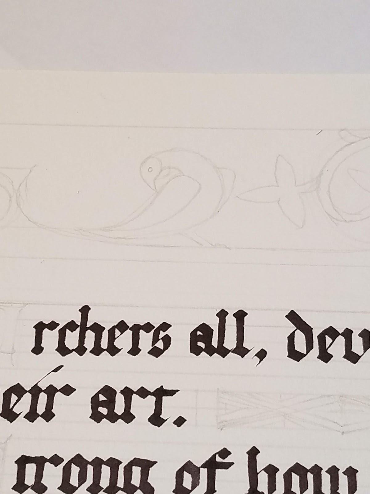
Now it's time for roughing in figures, critters, line enders, and other illumination. On the mockup at the bottom left, of the next picture, you can see where I tested one idea; looking at the actual source material, though, I discovered that these figures are waaaay too big in comparison. The figures in the Luttrell Psalter are typically only about as tall as five or six lines of text. There are bigger ones, but they are almost all grotesque figures whose heads and bodies might take up about half the page, but they end in vines and leaves that form a border for the rest of that margin. I don't want to do that here.


(Note: as of December 2018, I discovered that something had broken the links to all my images in this post, and I have not been able to find them all to replace. This image is missing, sorry.)

I am also debating whether or not to use any gold on this page. The final piece is going to be photocopied onto cardstock, and roughly 100 copies handed out to period archers throughout the Midrealm. Gold doesn't photocopy well, because it is shiny. You get either pale yellow, or brown, or even black depending on how it decides to reflect the light from the copier. So I'm thinking about cheating and painting my "gold" in yellow ochre, and then proceeding with the other colors. It'll also save me a step in the labor process. I love gilding, don't get me wrong (shiny!!), but it can certainly be time consuming, and if none of the recipients are actually going to see it... (no. I am NOT. Gilding 100 photocopies. I respect archers, BUT.)

The people who expressed an interest in this scroll did say you wanted to know more about my process. Welcome to the inside of my head. I get long-winded because I think I'm being educational. I hope you don't mind.

All right, enough talking, more drawing!

(Image missing)

Okay, here we are about two hours later (that's all?) with stuff mostly penciled in. I've included closeups of the various line enders and grotesque critters in the margins, as well as closeups of the archer and crossbowman.

Stuff you don't see: lots of measuring. The leaves of the left margin are spaced evenly and had to be a uniform size in order to match the Luttrell Psalter ("LP"). Also, lots of erasing. I did my best, but the archer and crossbowman still don't match the originals. I mostly got the proportions right, so that's something, but some of my angles are wrong, and of course, I only have a small, blurry copy of the crossbowman to go off for things like the drape of his clothing. (Drapery is HARD.) Fortunately, it's possible to view the entire LP in glorious detail online, along with thousands of other manuscripts, thanks to the efforts of libraries all over the world to digitize their collections of one-of-a-kind materials like this one. I'll just have to move my laptop to my scribal worktable and open the viewer.

Some more detail closeups. Sorry for the poor quality, zoomed in images require more light and I didn't have any.


Fun with vines, coming off a line ender or line fill, or whatever they're officially supposed to be called.


The left border is relatively skinny, but the evenly spaced and equally sized leaves still provided a challenge to measure and draw.


A whimsical grotesque from the Luttrell Psalter. I'm getting most of my border and critters from page "158r" of the book itself. (In manuscripts, "r" and "v" stand for "recto" and "verso", the front or back of a single leaf or "folio" of the book. There, now you've learned a thing today.)


Another look at the critter, sort of half bird, half fish, only wearing a cloak? Don't ask me, medieval people were weird sometimes.


I thought this dove-like bird was especially sweet.


And here, finally, are the archer and crossbowman figures. You know, sort of the whole point of this scroll?)

This has been a long post, so I'll wrap up with a bit of an educational note for the people who have asked how I do my work. For beginner scribes and non-scribes, here are today's tools: a 5H pencil and a click eraser. Pencils come in various hardnesses of lead, and 5H is the hardest I could find when I was adding to my toolkit. This gives me a very light, easy to erase line, as long as I don't forget and try to press harder in order to make it more visible. It's very easy to carve the line right into the paper if I'm not careful.

(Edit: As of December 2018, I discovered that for some reason every image on this post had been eaten, and I'm not able to replace them all because I can't find them all. My picture of my pencil and click eraser are missing.)

The click eraser is great, because the soft white silicon will clear my marks without scratching the paper, and the shape means I can "sharpen" the end to a point (remember how you did that with crayons as a kid, by coloring with every side of the crayon?), and then using the point to get into tight spots and clean up what I need to without erasing the stuff I want to keep. You should be able to find one at pretty much any office supply store.

All right. The next steps will be to make sure I have enough of the colors I'm going to need in order to color this (right now I have no pink), and then to get started laying in the base coats of everything. I've decided to skip the gold after all, and use yellow ochre as a substitute. Hopefully it will look okay!

Thanks for enjoying a nice long post. See you next time!

Sunday, May 6, 2018

Archery scroll: research and prep


Day 2 of the archery scroll project. Here are some source pics of the art I'll be adding to the scroll, from the Luttrell Psalter...

Also the thing on the bottom left, for new scribes and non scribes, is a little godsend called an Ames lettering guide. It lets you make rows and rows of evenly spaced guidelines without having to take all day to do it. It's an essential part of my kit! (I mean, there might be scribes who don't need one of these, but I'm sure not one of them.)

There are steps and work that go into a scroll that a recipient never really gets to see, and research is a big part of that. For this piece, I debated whether I wanted to go early period or later, for ease of decoration, and eventually opted for the Luttrell Psalter because it's from right in the middle of period archery, about the 1300s. Some archers go later and some earlier, so it felt like meeting in the middle would be a good compromise.


So here's the second mockup I did (I didn't take any pics of the first). Mockups are important to help you get a feel for how the text is going to flow and fit onto the page. In this case, the first mockup I did made it clear that not all of Lady Meadhbh's words were going to fit, so I had to go through and figure out what I could sacrifice and still have the piece make sense. But when I was done, I really liked the flow of it and the way that some of the lines gave me gaps at the end. The Luttrell Psalter and a lot of other manuscripts fill those gaps with line enders (not sure if that's the technical term or not), decorated fills that can be abstract or have whimsical little beasties inside.


I have a sneaking suspicion that the original source material is even bigger than the letters I used here. If you remember day 1, when I was testing out filigree? Here's what it looks like when drawn at its proper size. Again, these are just in pencil, just a test run of what I will do later. In the final piece, the capitals will be either blue or gold, and the filigree will be in red, blue, or purple.


Saturday, May 5, 2018

My latest scribal adventures

Hello everyone! I've got another scribal project on my plate--two, actually, which is making me a very happy camper! One is a commission to promote period archery; once it's finished, we'll make about 100 copies of it to be handed out to SCA archers who use period equipment on the range. The other is a backlog award commission for a private client. His award was originally given in 1998, but for whatever reason, my client never received a scroll.

For the first scroll, I'm being paid in art supplies, which is a tasty currency indeed, and for the second, I'm bartering labor for labor and receiving some lovely soapstone-cast pewter tokens, the soapstone mold hand-carved. I'll be using the tokens as thank-yous and encouragements to hand out to people who do things that impress me... which is a great excuse to get myself to more events, really. I've been wanting to do that anyway, so this is good incentive.

I haven't started the second commission yet, and won't before the first one is completed. I like to only have one piece on my desk at a time, if at all possible. But I've got about fifteen pictures waiting for you, assuming my phone lets me upload them today, and lots of educational text. I am going to break them up into several smaller posts so I don't drive my readers nuts, and the ones for this commission are all going to be placed under the tag "archery scroll 2018" if you want to see all the posts together.

Without further ado, here is Day 1: test driving pen work filigree around some capital letters. I'm just using pencil here (and testing my crow quill with some purple paint). The actual letters will be much smaller.