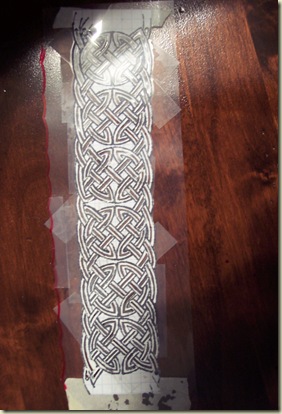
Okay. When last our intrepid heroes met (that'd be you and me), the milk can had a stencil on it that looked like this:
…which is pretty and all, but is only the tiny skeleton of the actual knot. In order to make the stencil without it falling apart, I cut channels that were only about a third as wide as the actual bands. Compare:
So, once I actually got the "skeleton" in place, it was time to flesh it out. For some reason I didn't get a photo of just that stage, but you can still see what went on here:
Take a brush that is the right width (if you're lucky, you'll have managed to make a knot pattern that matches a paintbrush in your arsenal already, without checking beforehand). Go over every single freaking one of the bands in the stenciled design and widen it. Carefully.
You can also see from the above photo that all that work to get a white band on the milk can – excuse me, the Big Damn Can – was for the sole purpose of having a background on which the actual color will show up. Painting the colors directly onto the olive-ish surface of the can would have made them dull and difficult to see without at least three coats for every color. As it stood, I still needed to go over the yellow more than once because it didn't want to lay down a nice opaque coat the first time through.
The color scheme for this piece was chosen to blend well with the background; our original choices of good old Irish green-and-orange were not going to cut it, but a rich mustard yellow, two shades of blue, and rust red did the trick nicely. When working on a project like this, always start with the lightest color and work your way toward the darkest.
I like this detail shot, because it gives you more of a sense of the structure of the knot pattern itself. The yellow actually comprises two separate bands running along the top and bottom of the design. The blue bands thread their way through the yellow, occasionally doubling back into a kind of figure-8 as shown here, before continuing on.
The figure-8s are mirror images of one another throughout the pattern. Here you can see both blue bands complete, and a couple spots of yellow that I missed the first time through.
Just in case you wanted to get the full effect.
In my previous post I talked a lot about "reminder lessons" – things that you should already know by now, but that you keep learning over again with each project. One of my favorites is, "Outlining rocks." This one was less of a reminder, since I'd already planned to outline the work and knew that doing so would bring the entire design to life – but still, it's always nice to see.
Now, if you look really closely at the above, you'll see places where the white background peeks through, or places where the color overlaps across the outlines into places it doesn't belong. The idea isn't to simply outline the color you have; it's to delineate where the bands are supposed to be, and yes, to point out errors so you can go back through and touch those up, too.
Which I did…
…all the while pounding into my head the main lesson for this piece: "If you're going to charge for knotwork, take what you think it's worth and triple it, at least." At the end of the day – and let me be clear, I am not in any way unhappy with what I made off the piece, and was happy to do the work – I probably was paid about 25 cents an hour once the effort behind the stupid stencil and Stencil 2: the Sequel gets factored in.
Secondary lesson: Never make stencils out of paper, you bonehead!
***
Coming soon: henna (maybe), mosaic stuff, embroidery, and a brief explanation of how I'm able to work on all these projects. Hint: unemployment helps.
Happy Thanksgiving to one and all.


No comments:
Post a Comment