All righty then, let's see what this thing looks like with a little color added, shall we?
The first color I laid in was the warm pink, which is not a color I'm used to working with in medieval manuscripts. Shows you what I know, because that stuff is all over the Luttrell Psalter. After that, it was time for the teal-green sort of color, and the red, which I used to shade a bit of the pink areas.

After that, it was time for the blue. I didn't use my usual shade of blue here, I went with something a little warmer, but I think it worked out all right. It goes nicely with the pink, anyway.

Once the blue was laid in, it was time to start work on all those smaller areas that I freely admit I was avoiding: the miniature in the big initial, the coat of arms and weird critter on the right, and the big coat of arms on the bottom. Gray, yellow, other shades of green...

Here are a couple of detail shots, because I love taking detail shots.


I do love it when the brush stays sharp and the paint behaves. If you look carefully at the miniature above, you can see where I actually added in a left hand and such for the wood carver, that I'd mistakenly left out prior to painting. Also, the bright reflection of the gold makes my camera dim the exposure, sorry for that.
Now here's the entire piece with all the colors laid in, ready for shading and the final stages of production.

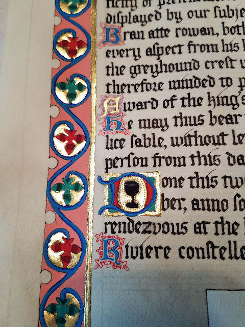
First, though, I gotta show off that D again, because the miniature came out REALLY well! Yes, all that work was done with the same size paintbrush. This is why getting a brush with a sharp point to it is so critical:

Finally, it's time for shading! And other fine line detail work. The red got a dark reddish-purple added to it, the green just got a darker version of the same pigment, and the blue got ultramarine. It's really coming together, now! And yet, still not finished.

Here are a few closeup shots that I thought might be of interest. You can see the filigree pen work I added around the smallest capital letters, red to the blue letters and purple to the gold letter. You can also, if you look closely, see where I did a test run of the gold texturing around the D with the black chalice decoration.


The above picture shows the gold texturing much better, as well as the fine filigree work on the letter below it, AND the error I mentioned in my previous post, where the lowercase Z is messed up. If you were to touch that area, you'd feel that the parchment is slightly fuzzy from where I scraped away the ink that didn't belong. Probably my knife blade could have been a bit sharper, there.
Okay, so this was a really picture heavy post, but I hope it was educational or at least entertaining. I have one more blog post planned to get caught up with where I am currently on the project, and then I'll slow down posting again. Thanks to everyone who is following along! I really appreciate it. If you like my work, please consider "buying me a coffee" to support it!
See you soon!
posted from Bloggeroid
No comments:
Post a Comment