The Black Hours pieces I've done are so striking, that it seems like as soon as I complete and show off one, I get another potential client asking if I'd be willing to do another. That was absolutely the case following September's Walt Whitman quote, "Keep your face always toward the sunshine, and shadows will fall behind you."
In this case, the client wanted a quote from Mary Oliver's poem, "It Was Early", wherein the narrator is taking a nature walk just at sunrise and marveling at the beauty they see. I'm not familiar with Mary Oliver's work in general, which is just a shame, because I've had two clients come to me with quotes from her work and they both really spoke to me. In this case, after the year I and my family have had, "Sometimes I need only to stand wherever I am to be blessed" was just an amazing sentiment.
Text mockup, checking letter forms and filling the border with various sketch ideas for the roundels. There might be some leftover images there from the previous commission, as well.
After that, it was time for margins, the text block, and of course all the vines. I believe I did still copy a page from the manuscript facsimile for this one, just to make sure I got the density right. I have a tendency, when I'm not working from a source, to be too timid and end up with very open vines and a lot to empty space that I then have to fill in.
Text in silver, with the word "blessed" in gold. I'm using Finetec/Coliro metallic paints for this, just thinned and loaded into the pen with a paintbrush rather than dipping into the paint cake. Colors are Sterling Silver and Arabian Gold.

Time to start those large elements in the border. If you follow this blog at all, you'll know by now that I work largest to smallest, and usually these large acanthus leaves are in silver and gold.
I'm just going to take a moment to tell you how VERY proud I am of this pinecone. I found reference pictures and drew two or three to practice before drawing this one, and then painting over it in silver. It turned out even better than I had hoped. The shadow of my phone is deliberate, to ease the glare from the metallic paint, so you can see the details a little better.
Silver and gold all set! This was a fairly balanced piece, but I remember being surprised by how much silver and gold was in that narrow left border compared to the rest of it.
The poem has several references to elements of nature, including a weasel hunting mice, an owl, and of course trees. Here's the weasel with base coats laid in; I am very grateful to the mighty Google for providing reference images that worked. Without a sense of scale, many people looked at this critter and thought he was an otter, which is fair considering that weasels and otters are related. But no, not an otter.
Not sure how well the details show up here, but I've added whiskers and claws, and a bit of shading and texture to the coat.
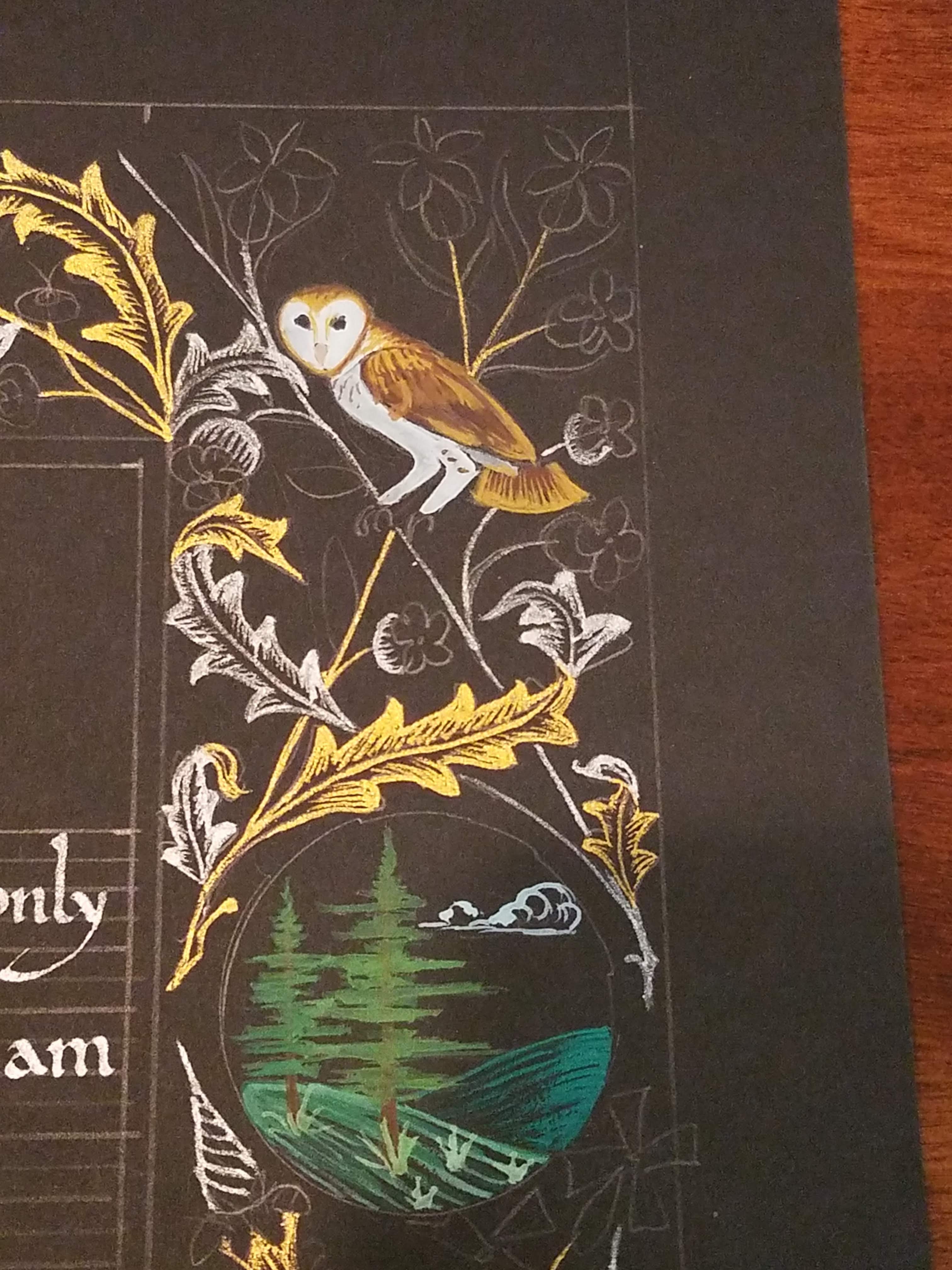
A barn owl I was also really, really proud of, and the first roundel, with pines on a hill.
Here's that same roundel with some better highlight added to the trees; they were a little flat before.
For my second roundel, I wanted a weeping willow tree, and I thought I had it right, but then I realized, no, this is a pretty sad looking tree. For one thing, it doesn't have any leaves on it.
There we go, much better. But still kinda missing something...
Oh right. Highlights! A little bit of rose on the tree and in the water to indicate a sunrise, and more definition for the cattails, and it looked waaaaay better.
After that, it was time to add field mice! These are such adorable little critters that they are a favorite of photographers, which meant lots of reference shots for me to work from. Very helpful. Thank you, photographers of the internet.
I mean, just look at those little tails.
So here's that stage of the coloring complete; the only area that I didn't give you a detail photo for were the pine needles that I added beneath the pinecone above. Now it's time to color in the flowers, with red, blue, and white. All these flowers are part of the original source material from the 1480s.
After that, there were green things to add as well, including the pears on the top, to the left of the pinecone; strawberry tops; and leaves and such throughout the piece. I love how with each stage, the border comes together more and more. It's also fun to show pictures to people and have them remark on what they think is the finished piece, when there are more stages yet to add.
The next stage is to add the silver and gold highlights to the leaves, fruit, roundels, and critters.
The shaping and texture of the gold on the weasel came out really well. The mice also look lovely, but the owl is the one that really blew my mind.
The added texture in the wing feathers and the tail just really made the owl leap into focus for me. I was very pleased with how that came out!
And here's the finished border; all that's left is to outline the roundels and border in silver, and erase my pencil marks inside the text block. I never worry about erasing the pencil marks anywhere else, because for the most part, they get buried under all the busy-ness and color.
Signed, sealed, and delivered in October of 2020, a little before Halloween. My client was thrilled, and so was I.
I got a little tired of doing Black Hours pieces back to back, though, so my next one was something completely different! I dropped back in time a couple hundred years and got to practice human figures with wonky posture, which is always entertaining.
Until next time!


No comments:
Post a Comment