Tuesday, June 7, 2022

Should I close the doors?

Well, here we are, after years of intermittent posting and sporadic updates. I still want to keep this blog, but I think I'm moving my scribal updates to my SCA website, Matildis.art, and possibly keeping this one for other things.

What other things? I've stopped doing henna, I'm no longer a freelance editor... so much has happened in the past couple of years, which I haven't posted about. And I have Facebook and Instagram for most of my updates on my personal life. And yet I'm busier than I've ever been, with art, writing (amateur level, nothing published yet), work, parenting, music... my life and my heart are full.

Should I retire "littlefiddlybits"? I don't want to delete it, I have way too much stuff here going back too far to want to erase. Should I dual-update both here and on Matildis.art? I can't decide.

I'd poll my audience but I think only about three people follow this blog, anyway. It's more of an archive for myself than for anyone else.

Decisions, decisions. In the meantime, here is a picture of me with blue hair for my 50th birthday.


Sunday, February 28, 2021

Black Hours, Mary Oliver, October 2020

 The Black Hours pieces I've done are so striking, that it seems like as soon as I complete and show off one, I get another potential client asking if I'd be willing to do another. That was absolutely the case following September's Walt Whitman quote, "Keep your face always toward the sunshine, and shadows will fall behind you."

In this case, the client wanted a quote from Mary Oliver's poem, "It Was Early", wherein the narrator is taking a nature walk just at sunrise and marveling at the beauty they see. I'm not familiar with Mary Oliver's work in general, which is just a shame, because I've had two clients come to me with quotes from her work and they both really spoke to me. In this case, after the year I and my family have had, "Sometimes I need only to stand wherever I am to be blessed" was just an amazing sentiment.

Text mockup, checking letter forms and filling the border with various sketch ideas for the roundels. There might be some leftover images there from the previous commission, as well.


After that, it was time for margins, the text block, and of course all the vines. I believe I did still copy a page from the manuscript facsimile for this one, just to make sure I got the density right. I have a tendency, when I'm not working from a source, to be too timid and end up with very open vines and a lot to empty space that I then have to fill in.

Text in silver, with the word "blessed" in gold. I'm using Finetec/Coliro metallic paints for this, just thinned and loaded into the pen with a paintbrush rather than dipping into the paint cake. Colors are Sterling Silver and Arabian Gold.

Time to start those large elements in the border. If you follow this blog at all, you'll know by now that I work largest to smallest, and usually these large acanthus leaves are in silver and gold.

I'm just going to take a moment to tell you how VERY proud I am of this pinecone. I found reference pictures and drew two or three to practice before drawing this one, and then painting over it in silver. It turned out even better than I had hoped. The shadow of my phone is deliberate, to ease the glare from the metallic paint, so you can see the details a little better.

Silver and gold all set! This was a fairly balanced piece, but I remember being surprised by how much silver and gold was in that narrow left border compared to the rest of it.

The poem has several references to elements of nature, including a weasel hunting mice, an owl, and of course trees. Here's the weasel with base coats laid in; I am very grateful to the mighty Google for providing reference images that worked. Without a sense of scale, many people looked at this critter and thought he was an otter, which is fair considering that weasels and otters are related. But no, not an otter.


Not sure how well the details show up here, but I've added whiskers and claws, and a bit of shading and texture to the coat.

A barn owl I was also really, really proud of, and the first roundel, with pines on a hill.

Here's that same roundel with some better highlight added to the trees; they were a little flat before.

For my second roundel, I wanted a weeping willow tree, and I thought I had it right, but then I realized, no, this is a pretty sad looking tree. For one thing, it doesn't have any leaves on it.

There we go, much better. But still kinda missing something...

Oh right. Highlights! A little bit of rose on the tree and in the water to indicate a sunrise, and more definition for the cattails, and it looked waaaaay better.

After that, it was time to add field mice! These are such adorable little critters that they are a favorite of photographers, which meant lots of reference shots for me to work from. Very helpful. Thank you, photographers of the internet.

I mean, just look at those little tails.

So here's that stage of the coloring complete; the only area that I didn't give you a detail photo for were the pine needles that I added beneath the pinecone above. Now it's time to color in the flowers, with red, blue, and white. All these flowers are part of the original source material from the 1480s.


After that, there were green things to add as well, including the pears on the top, to the left of the pinecone; strawberry tops; and leaves and such throughout the piece. I love how with each stage, the border comes together more and more. It's also fun to show pictures to people and have them remark on what they think is the finished piece, when there are more stages yet to add.

The next stage is to add the silver and gold highlights to the leaves, fruit, roundels, and critters.

The shaping and texture of the gold on the weasel came out really well. The mice also look lovely, but the owl is the one that really blew my mind.


The added texture in the wing feathers and the tail just really made the owl leap into focus for me. I was very pleased with how that came out!

And here's the finished border; all that's left is to outline the roundels and border in silver, and erase my pencil marks inside the text block. I never worry about erasing the pencil marks anywhere else, because for the most part, they get buried under all the busy-ness and color.

Signed, sealed, and delivered in October of 2020, a little before Halloween. My client was thrilled, and so was I.

I got a little tired of doing Black Hours pieces back to back, though, so my next one was something completely different! I dropped back in time a couple hundred years and got to practice human figures with wonky posture, which is always entertaining.

Until next time!

Monday, November 30, 2020

Calf to Codex

 I don't think I ever posted about this back when it happened, so I figured now would be a good time.

In about 2010 (I think), Master Johannes von Narrenstein had a brilliant idea. We in the SCA, he posited, have all the skills needed to produce a book from start to finish. We have parchment makers and bookbinders, we have calligraphers and painters, we have people who make paints from scratch out of authentic pigments. Why not make a book?

The project took five years, and about seventy-five people, most of whom were poets and composers who provided the content for the book. But they did it, and Codex Mediterraneae is a thing that exists, and I and my child were part of it.

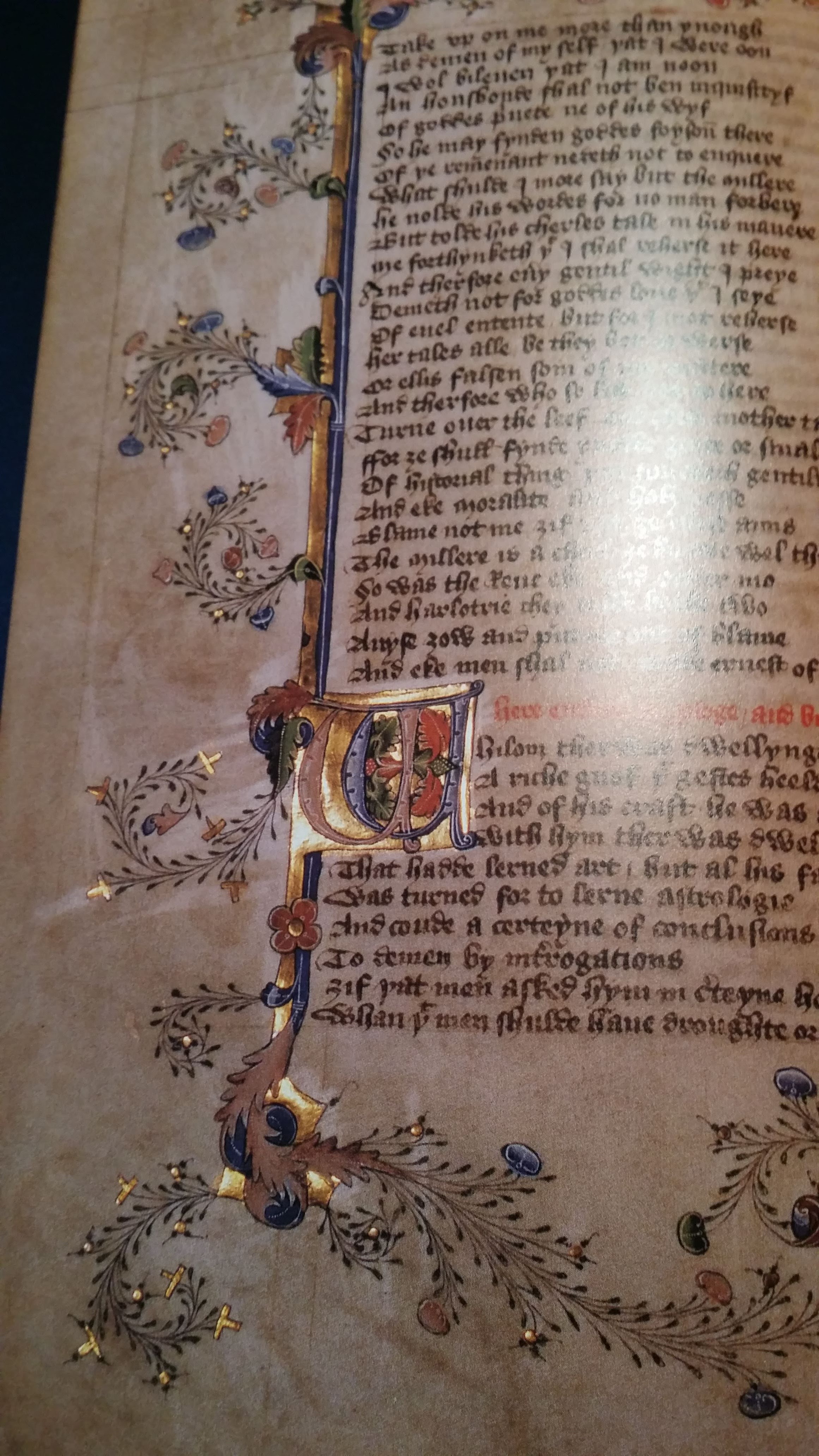
I don't have pictures of all the pages; I was given only the first "gathering" or "quire" of eight pages, and only had to write on about half of them. The very first poem was written about the Middle Kingdom's first king, and set to music in a style that honored the 600th anniversary of the Battle of Agincourt. I took an online course in medieval music notation so that I could transcribe the music to medieval notation and make it "look right" for our book.

The lyrics and notation for the song.

Everything about this book was done as authentically as possible. The pages were parchment made from donated deer hides. The writing was done with black and red ink made from medieval recipes, and a goose quill pen. I was not allowed a pencil to sketch things, I was given a stick of lead! 

Here are as many photos as I could find of the project, with as little rambling commentary as possible.

Testing the inks and alphabet

A mockup of the text and notation of the first page.

Penciled guidelines for the pages

A marble slab to mull pigment, a bottle of gum arabic solution, a glass rod to stir them together, and a shell to put the paint in. I ended up not mulling the red at all.

Painting the guidelines onto the vellum, without a ruler; if you look closely, you can see where I scraped off the leftmost line because I got the spacing incorrect on it.

One page fully lined.

"On the occasion of the 600th anniversary of the Battle of Agincourt, a song of history based upon the Agincourt Carol. Words by Nicolaa de Bracton; tune by Ursula Mortimer."

Lining the page for musical notation is not at all the same as lining it for text!

The page is paperclipped to my guidelines on all sides.

My practice sheet, with the modern notation above and medieval neumes on the bottom.

Copying the musical notes onto the page so that they line up correctly with the words.

Page two of the music. I only included notation for verse one and the refrain; the rest of the lyrics are written as poetry.

The remaining verses.

My favorite part of my assignment: The book curse!
"If anyone take away this book, let him die the death; let him be fried in a pan; let the falling sickness and fever seize him; let him be broken on the wheel, and hanged. Amen." This is a translation of an actual book curse from the Middle Ages.

Preparation to mull pigments for paint.

Assistance with mulling azurite into a fine enough powder to make paint. This is my child, age 10 at the time.

Azurite behaves oddly in that it gets lighter the longer you mull it. The pale yellow-blue to the left is not what we wanted, but the darker blue is almost too gritty to paint with. It definitely added texture to the page, let's put it that way.

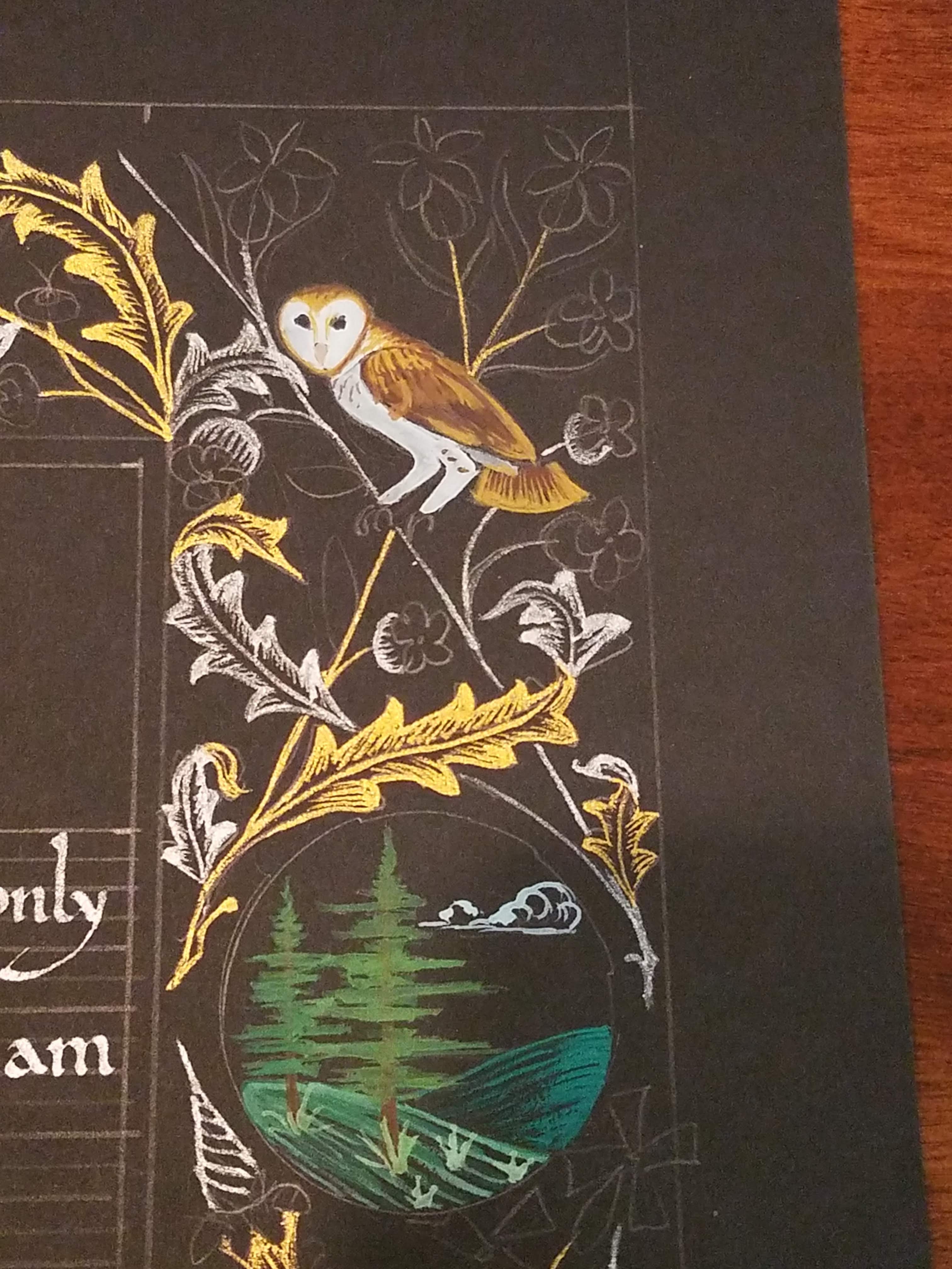
An example page from the 1400s of the illumination style we were to use. We were given several options to play with, but this was the style I preferred.


Sketching a beast modeled after one found on a tapestry dated to the early 1400s.

Preparing the gold leaf; as with the rest of the book, we were not to use modern adhesives. Behind the leaf, you can see a tiny jar of garlic juice.

Gilding upside down, as one does.

Burnishing the gold onto the page so that it will stay.

Sweeping away the excess to reveal the letter underneath.

Painting with garlic juice, in the areas where the gold is intended to stick.

A page of gilded initials.

A fully gilded page, ready to paint.

The gold is in place on this page but the excess has not yet been brushed away.

I always enjoy that before-and-after moment of gilding.

Base colors on the beast; the green is still wet here.

Vine work, leaves, and flowers are added to the golden bar.

The page fully illuminated.

Penwork around the initials on the music page; you can see where the gritty azurite failed to provide fine lines around the red "I".

Another page decorated and ready to go.

Not shown is my child assisting with the painting; the scales were laid out in white and then covered in blue, to give them good contrast with the green. My child painted the blue entirely without help.

Finally the beast was highlighted in shell gold, and delicate vines added around it. In closeup, it may be possible to see the name "Arrantxa" (my SCA name at the time) written inside part of the vine underneath the beast. It actually reads "Arrantxa et Celeste me fecit." Arrantxa and Celeste made me. Celeste was my child's SCA name at the time.

The book itself has traveled to many SCA events to be read and sung from, and has been featured in at least one magazine article. You can read it here.

The Calf to Codex Project remains to this day one of the highlights of my scribal career, and I'm proud to have been even a small part of it.